Ford’s Nest Farm
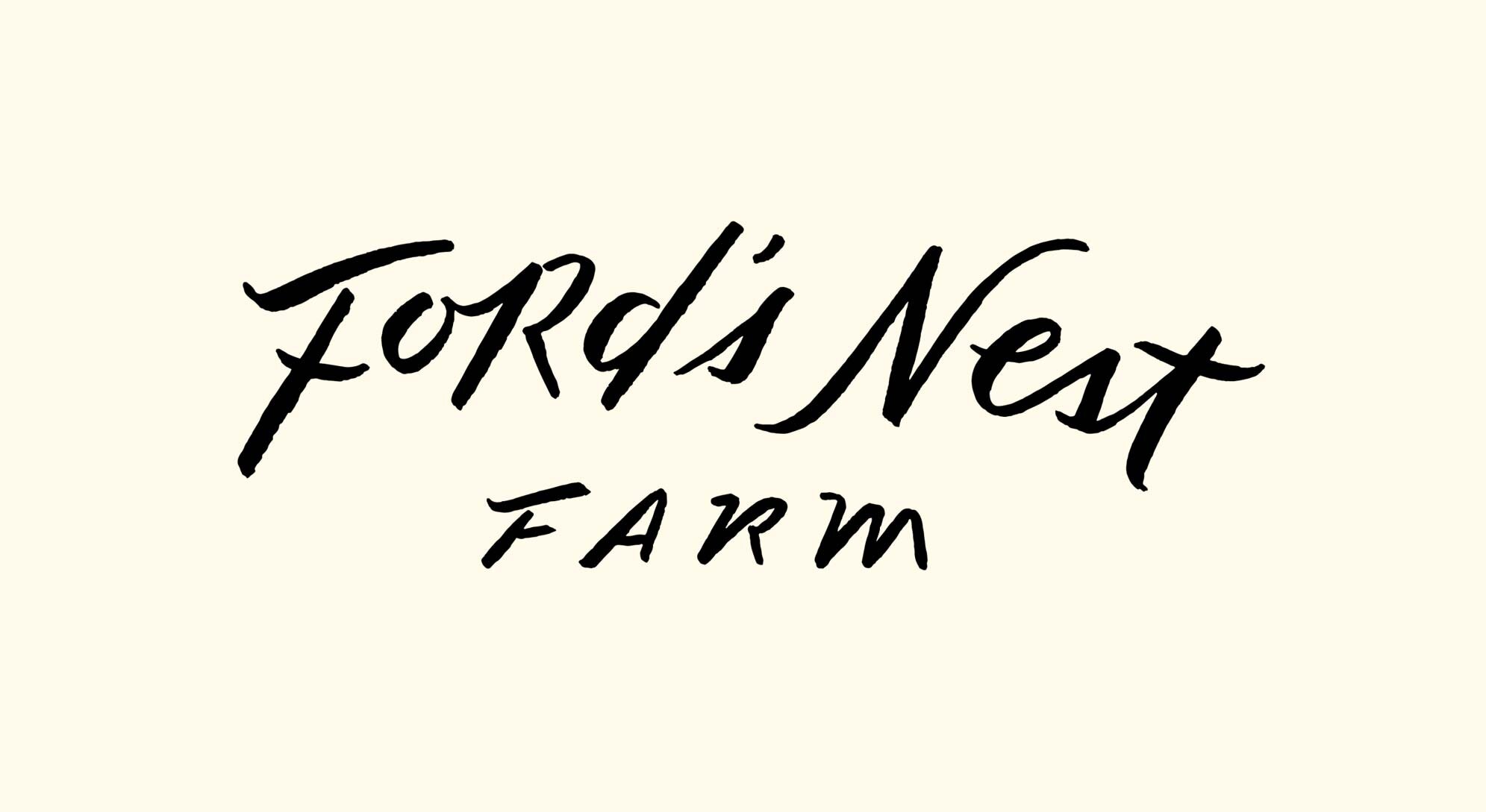
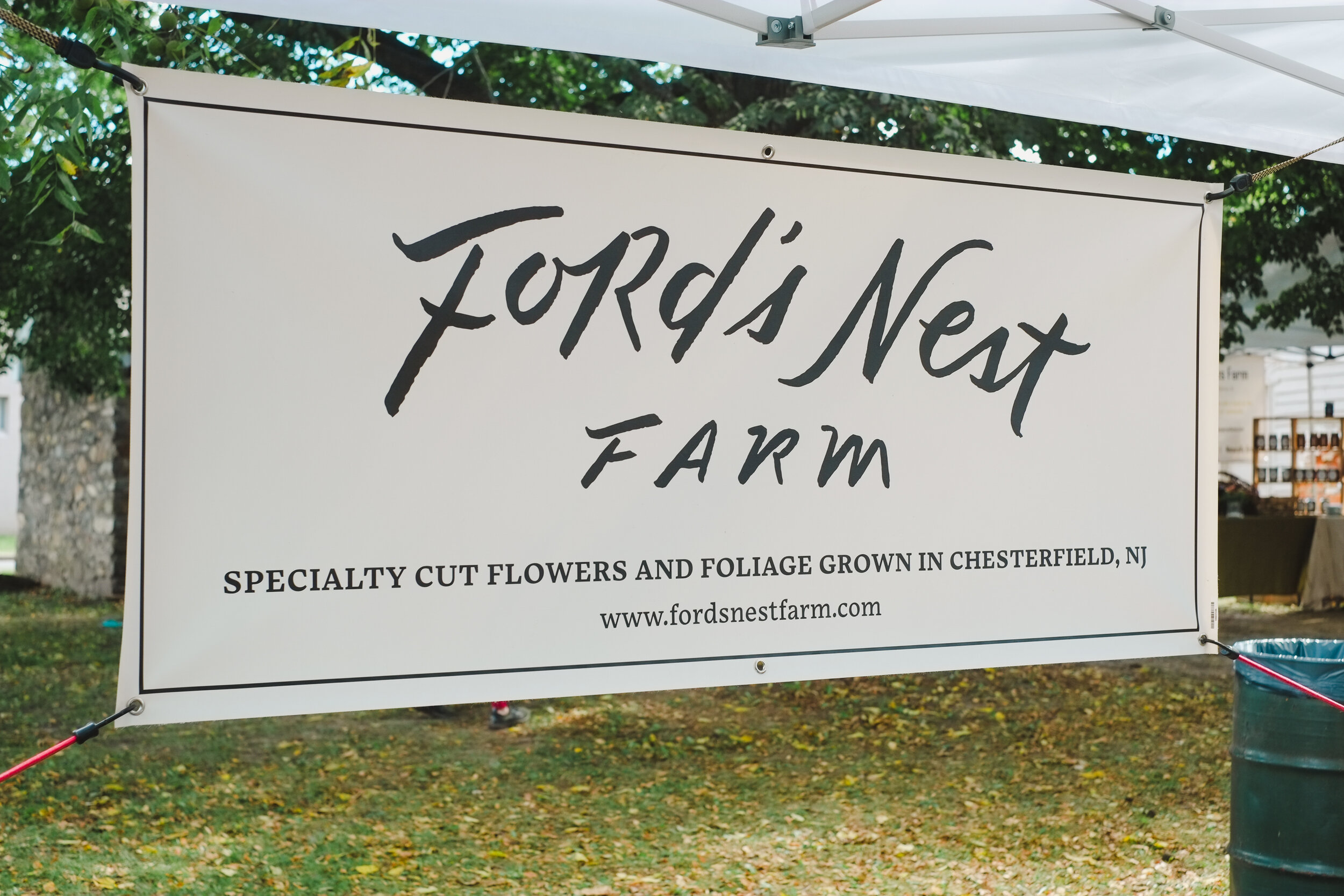
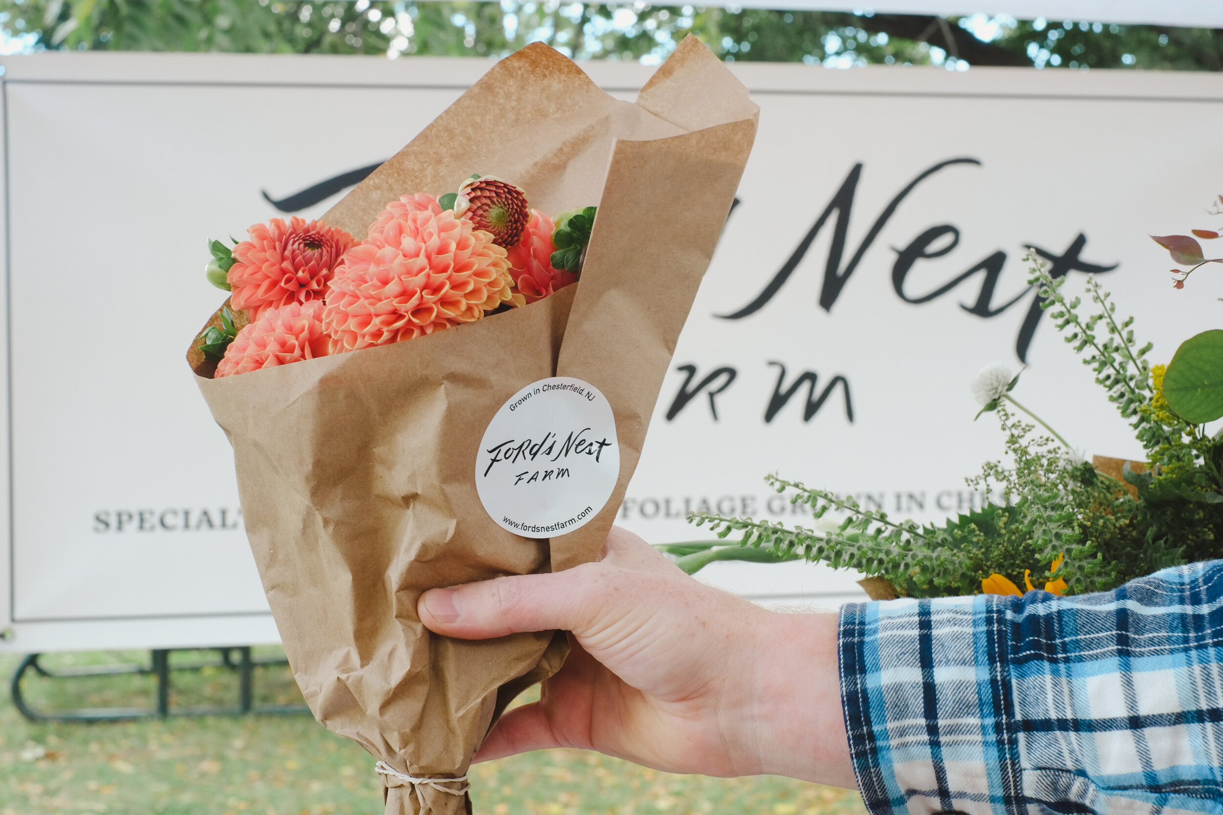
Hand drawn logo for local flower farmers Chris and Kelsey Ford. The textural, brush letters lend an organic quality, a bit like soil, and Chris and Kelsey chose this specific layout direction for the welcoming arc shape, like an old gate or summer camp sign. Also in the works is some rustic wooden signage at the entrance to their driveway. I couldn’t resist also making a little nest to go along with the logo.
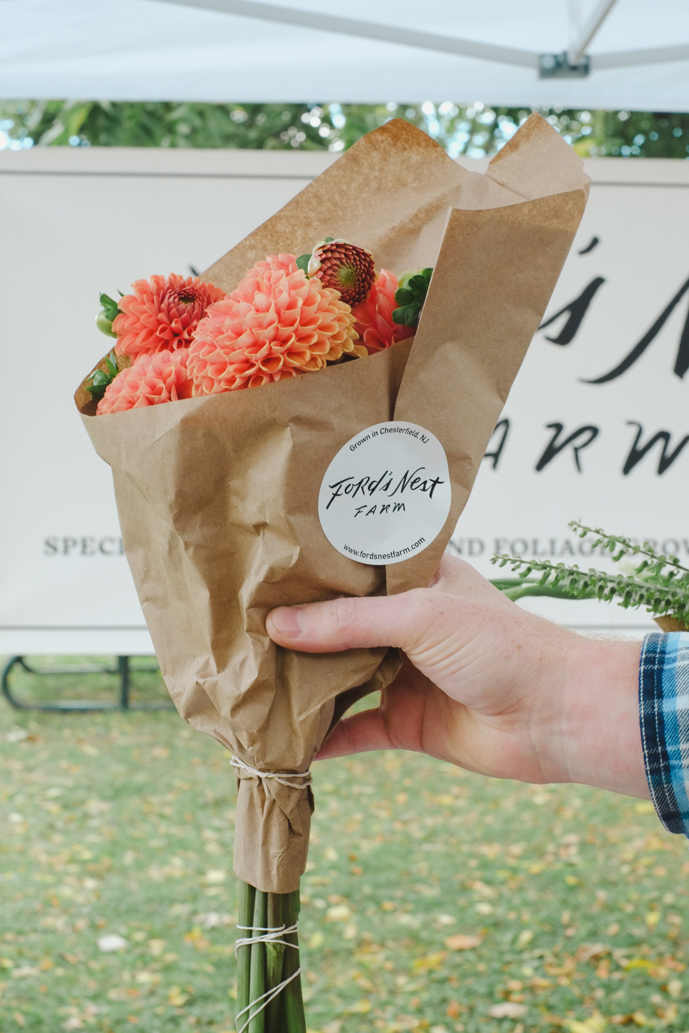
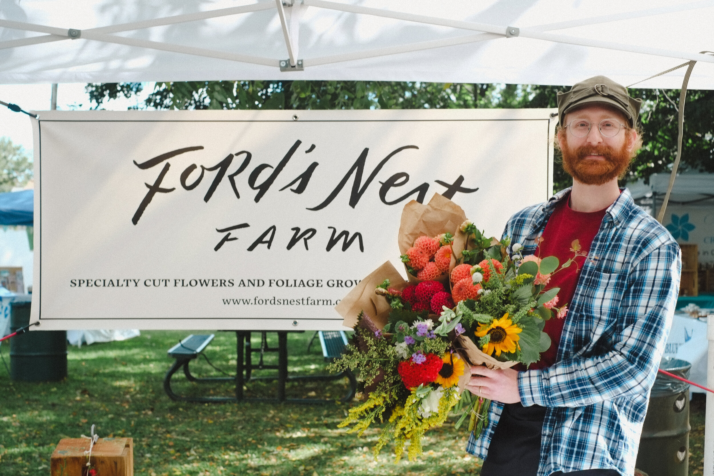
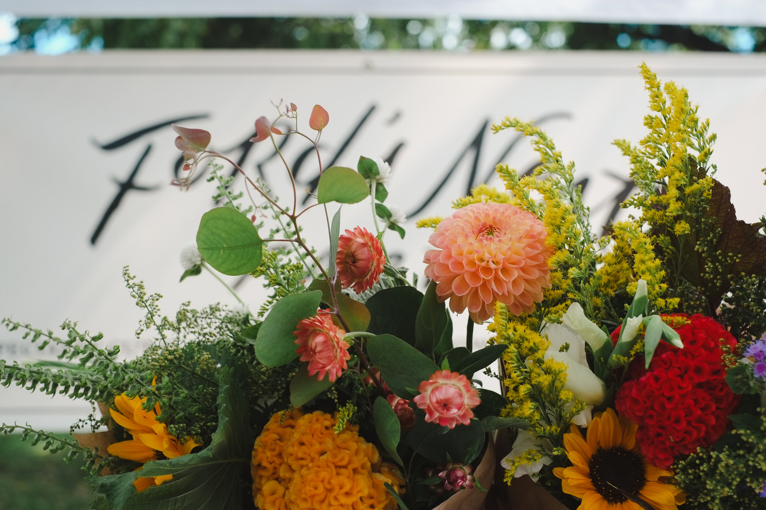
The logo is currently being used for their market banner, bouquet stickers, business cards, and website. We came to realize after finishing this job that we live just around the corner from one another! The above photos were snapped by me at a local farm market.
