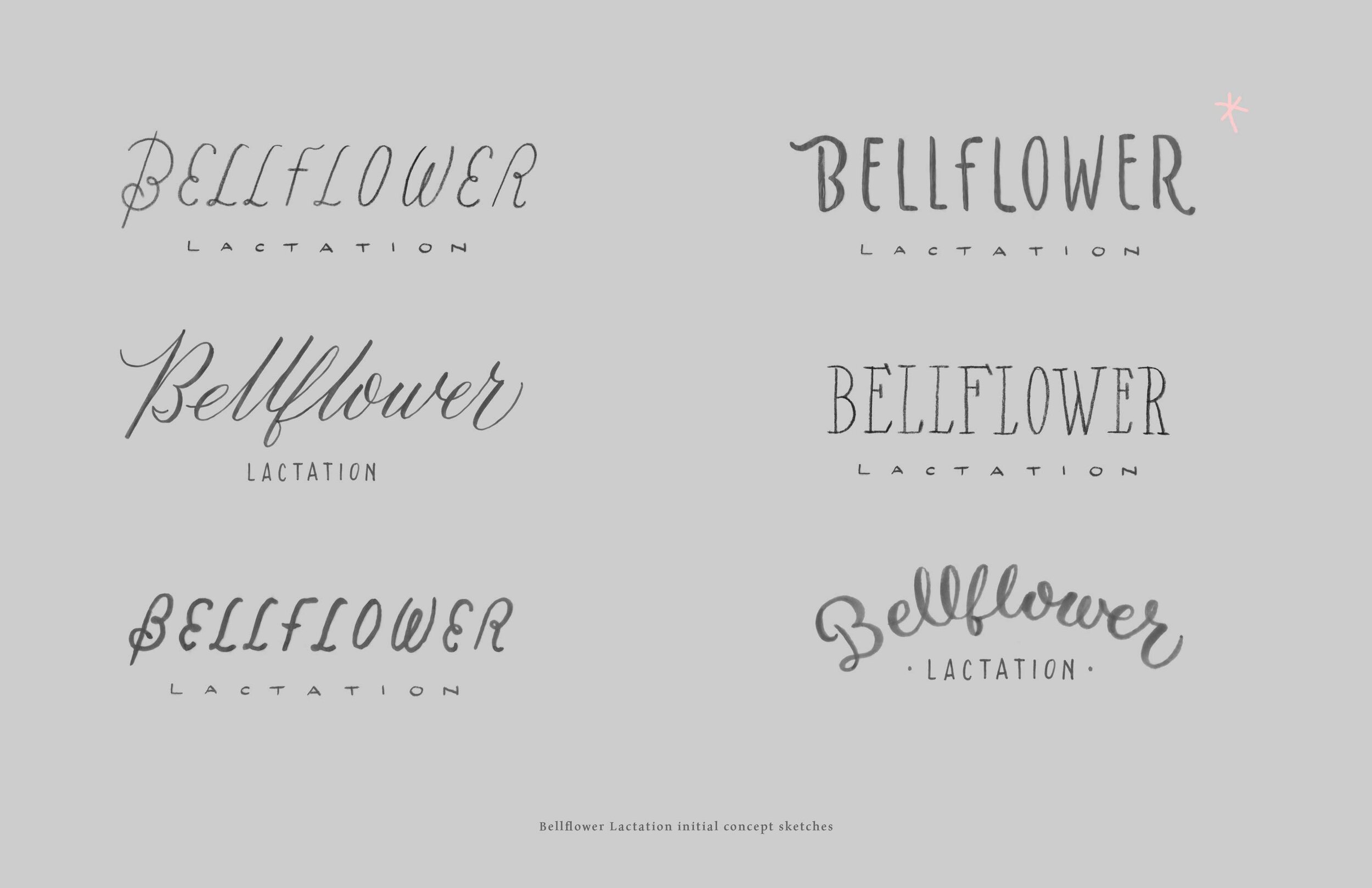
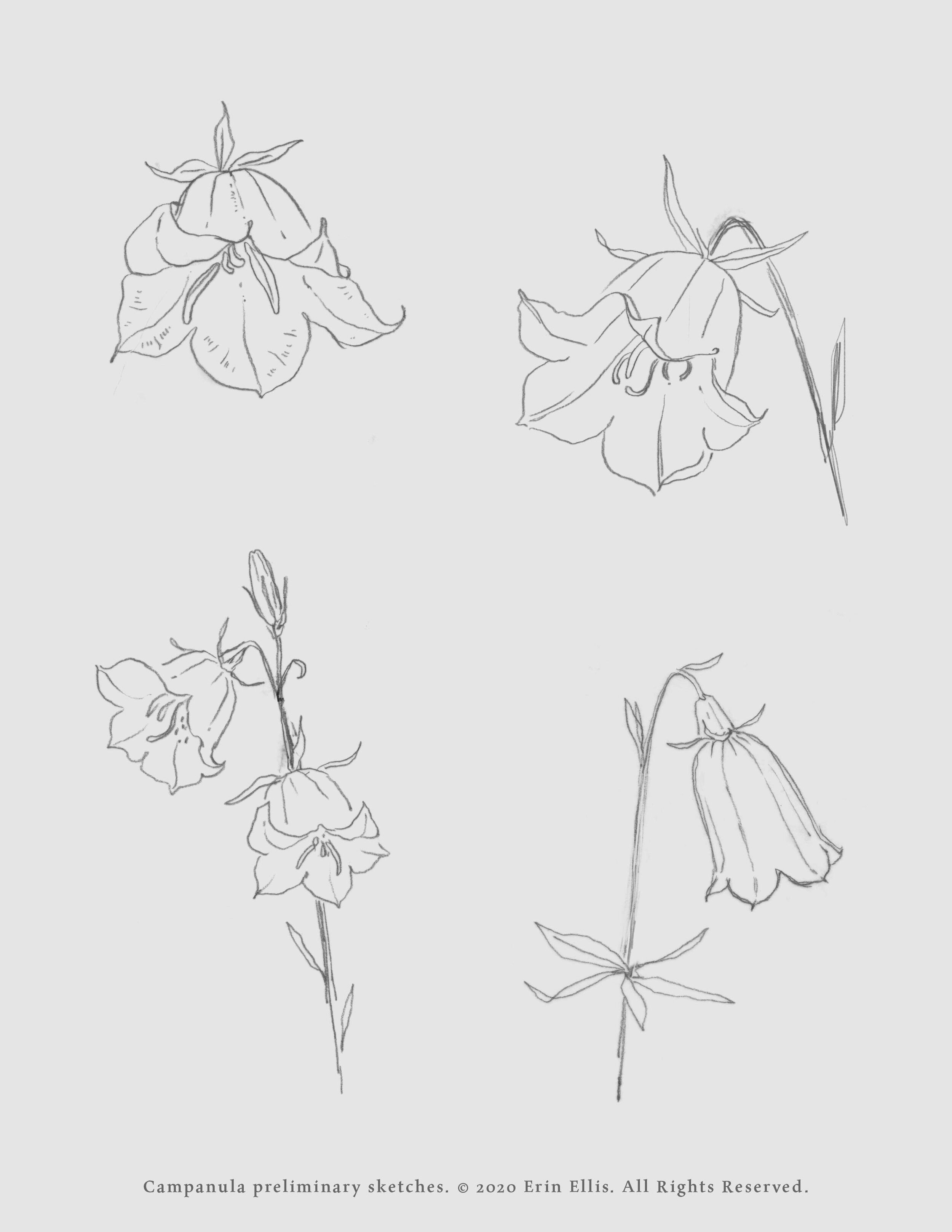
Bellflower Lactation
Hand lettered logotype and botanical spot illustration, both incorporating Campanula, for an independent lactation consultant in the Twin Cities. I think the need for softness here is obvious, and I subtly incorporated the shape of the bellflower symbol into the W for continuity with the name. The logo and illustration are painted in ink, the latter used as a background image on the website, which was beautifully designed by Billy Whited.
I am including some process images here as well, to help tell the story of how this was made.